
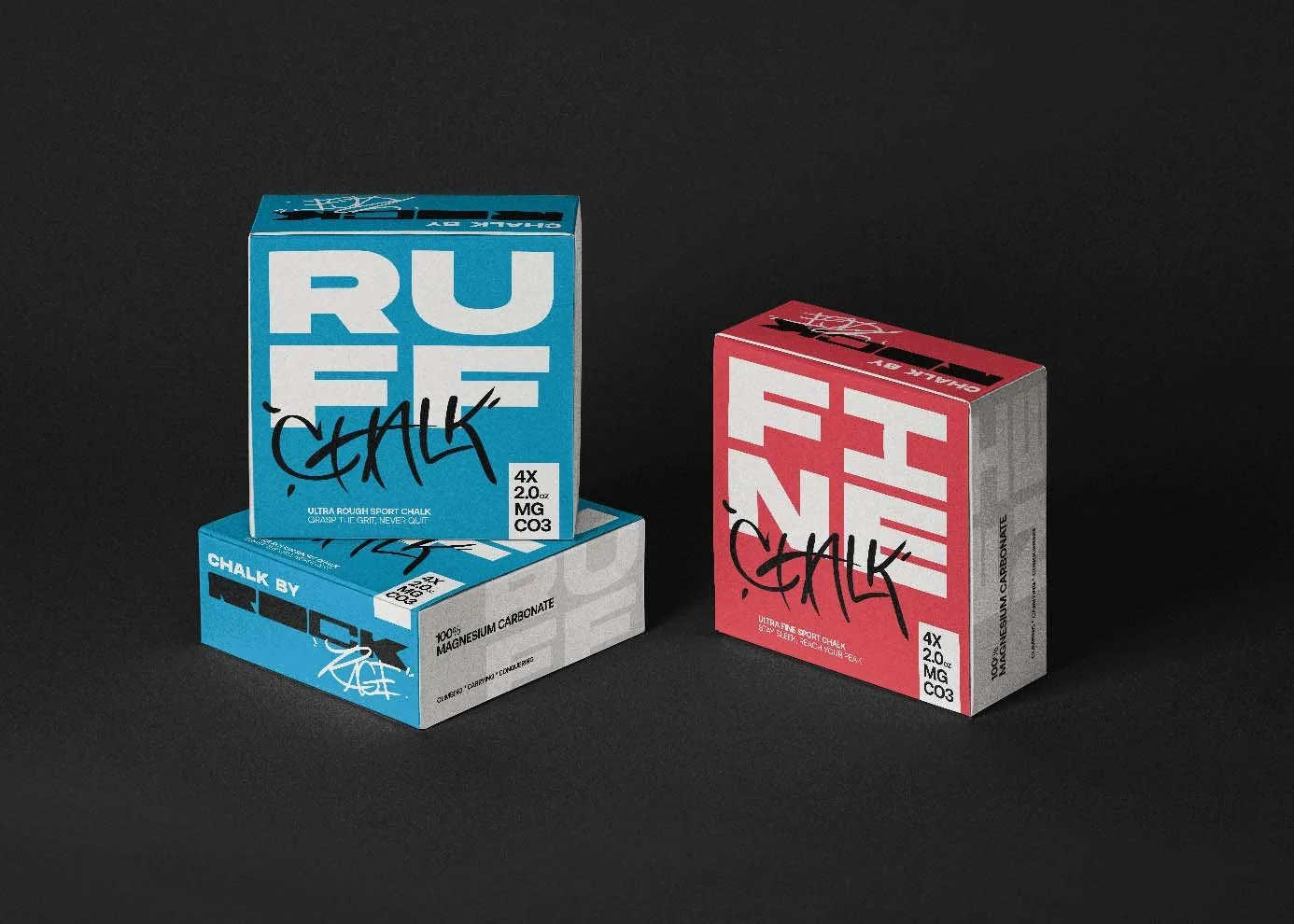

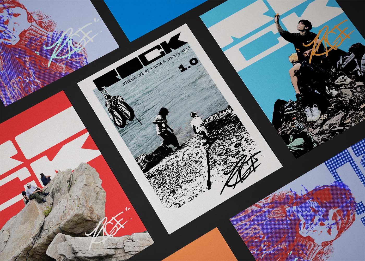

ROCK RAGE
Graphic Design, Photo editing, logo design
Tasked with capturing the essence of community, art, and exploration, this project began as a simple brief for a T-shirt design and evolved into a vibrant symbol of the Rock Rage collective's spirit.
The initial wordmark, though impactful, hinted at greater potential. Through a meticulous process of adaptation and refinement, it transformed into a dynamic graphic that encapsulated the values of Rock Rage while maintaining its standalone appeal.


To achieve the desired balance and avoid symmetry, two fonts were meticulously crafted by hand. "ROCK" emerged as a bold statement early in the process, setting the tone for the design, around which subsequent graphics were built. The layout and design of "RAGE" underwent several iterations, culminating in a combination that perfectly complemented its counterpart.


As the fonts were finalized, attention turned to the graphic elements. The original design, though rich in detail, was refined to enhance readability and visual impact. With the layout finalized, the fonts underwent a final polish to ensure they seamlessly integrated with the graphics.
The result is a graphic that not only adorns T-shirts but also serves as a powerful symbol of Rock Rage's values. This project showcases a commitment to creativity and craftsmanship, blending handcrafted design with digital precision to create a lasting visual identity for the collective.
